This responsive player maximizes the use of available real estate whether on a large screen or mobile device. The player was designed with a lightweight API to provide quick delivery.
Banner

The auto retracting banner displays the title of the presentation and the tab menu at the top of the player. The Tab Menu is dynamically generated based on what tabs are associated with the presentation. The banner will automatically retract when the cursor is off the player. A logo uploaded to the Player Config or Presentation Type will be displayed in the far-left corner. For more information on adding a logo, navigate to the Player Branding or Presentation Type sections of this document.
Timeline and Actions

At the bottom of the player is the timeline and controls buttons. This toolbar is dynamic, showing only those links relevant to the presentation.
|
Timeline |
Tracks where the player head is currently located. Chapters and Speech Search results are also indicated if applicable. Click anywhere on the timeline to move the player head to a specific location. |
|
Play/pause |
During playback the pause icon is displayed and when paused the play button is displayed. To toggle between these states, click the icon, click anywhere on the media or use the spacebar on the keyboard. |
|
Volume |
Clicking on the volume icon will open a slider used to increase/decrease the volume or to mute playback. |
|
Progress time or Live indicator |
Displays the current time of the player head location and total time of the presentation. |
|
New Window |
Opens the player in a new window. This can be helpful when the widget is too small to see the details of the content. This icon is displayed in mobile devices or in a widget |
|
Caption |
Appears only when captions are associated with the presentation. |
|
Display Switch |
Toggles between media and slides displayed in the primary window. This button only appears when there is media and slides. |
|
Picture-in-picture vs. side-by-side |
Toggles between picture-in-picture and side-by-side views of the media and slides. This button only appears when there both media and slides are present. |
|
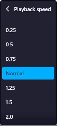
Settings |
Modify the playback speed of the video. |
|
? (Player Help Button) |
Contains links to documentation and videos related to Player functionality. |
|
Full screen control. |
Expands the player to the full size of the viewing screen. |
Caption
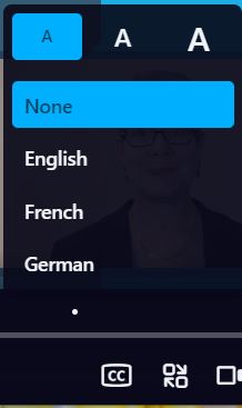
Clicking the Caption button opens the caption menu. The viewer may select from the list of caption languages associated with the presentation. Select None to turn off the captions. Click on an “A” to change the size of the caption font.
Captions are linked to the presentation in the Creator>Content>Captions tab during the creation or edit process. Standard SRT files are supported.
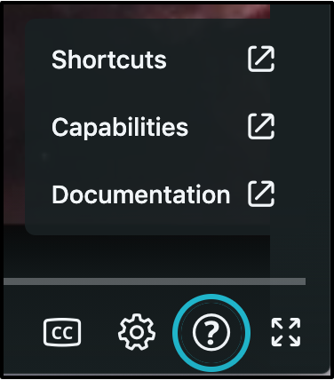
Player Help Button
The ? (Help) button opens a menu containing links to documentation and videos related to Player functionality; including keyboard shortcuts, Player capabilities, and a link to this specific documentation. These links are public and available to all individuals who access the Player.
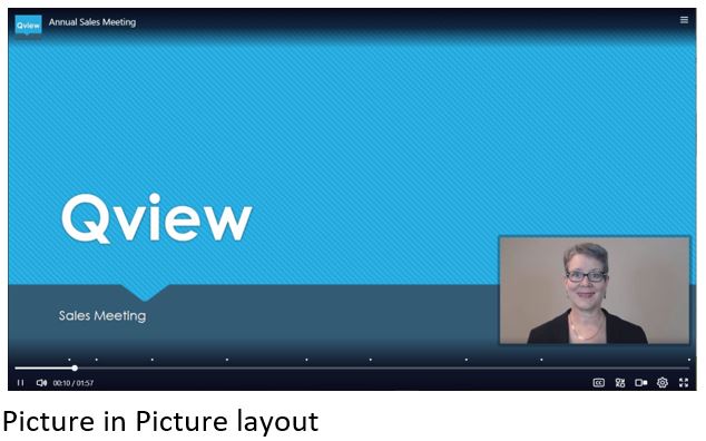
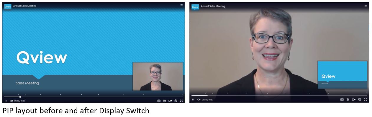
Picture-in-Picture (PIP)/Side-by-Side (SxS)
A presentation containing both media and slides will be displayed PIP mode by default. The slide will be in the primary media position and the media is the smaller overlay position. This is referred to as picture-in-picture (PIP) layout. The position of the secondary picture may be changed by the viewer or the creator of a VOD presentation. The viewer can click and drag the picture to the new position, whereas, the creator may apply an action to accomplish this for all viewers.
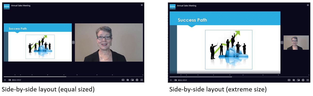
The viewer can also toggle between PIP and side-by-side viewing.
By default, the side-by-side (SxS) is displayed with media and slides equal in size. The viewer can click and drag the grip icon between the two images to reproportion the frames.
Display Switch
When both media and slides are included in the presentation, the viewer may switch the relative position of the content. This tool switches the display in either PIP or SxS layout.
Settings
Click the settings tool to change the playback speed of the presentation. Choose from multiple options to increase or decrease the playback speed.
Tabs
The side bar tabs are generated dynamically based on the characteristics of the presentation. The side tabs may individually be displayed or hidden depending on settings in the presentation type or Creator. The tabs may also be opened using the “Show tab…” action for VOD presentations.
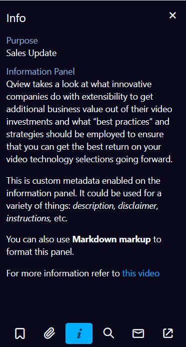
Info Tab (VOD & Live)
The Info tab may include any custom metadata fields giving you flexibility to display information relevant to the presentation. When Metadata is assigned to the Presentation Type, the admin can tick the “show in player” box to display the metadata on the Info tab.
Full text fields may also be formatted using Markdown syntax to bold, italicize, create lists, add links and more. Markdown syntax guides can easily be found online.
This tab may be enabled/disabled in either the Presentation Type or Creator.
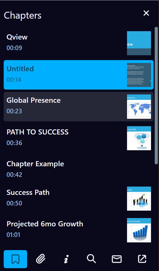
Chapters Tab (VOD)
The Chapters Tab will appear when there are slides included in the presentation or Chapters have been added in the Creator>Content>Media tab. The current slide being displayed is highlighted in the list. To move the player head to the start of a chapter, click on the chapter in the Chapter Tab.
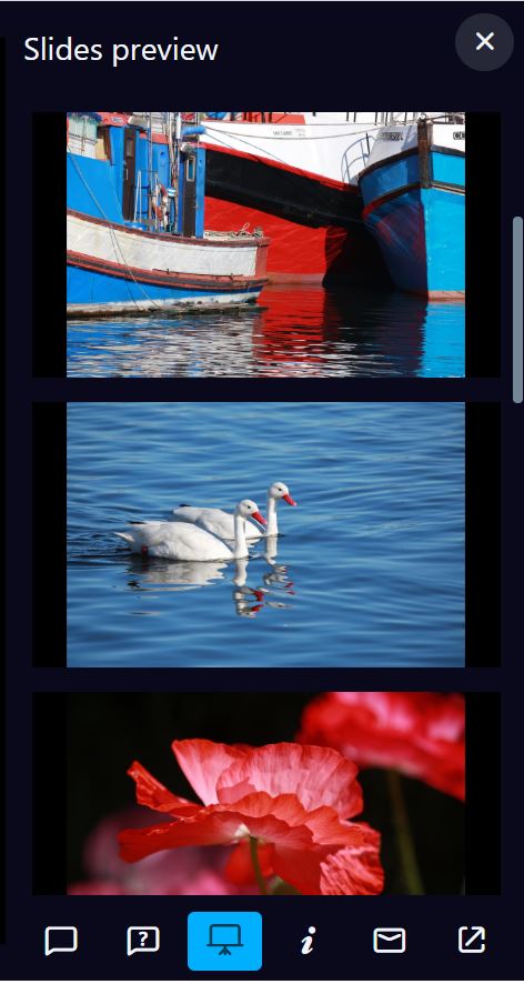
Slides Preview Tab (Live)
The Slides Preview Tab will appear when there are slides included in the presentation. When Browse Slides is enabled in the Presentation Type or by the author, all the slides will be displayed allowing the viewer to navigate through the slides at will. When this feature is disabled the slide will be added to the list when it is viewable in the live event window.
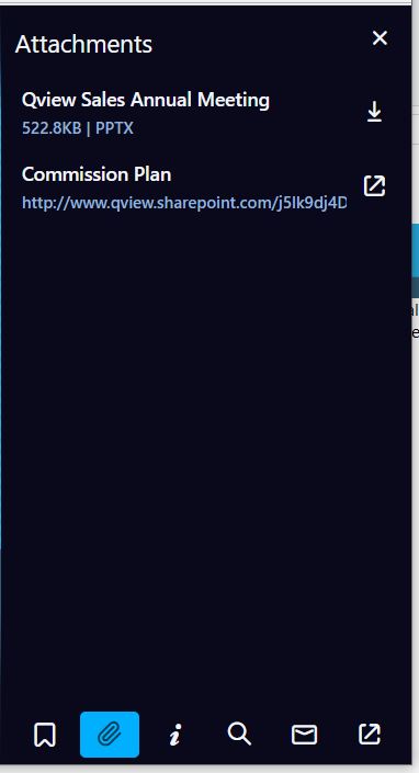
Attachments Tab (VOD & Live)
Documents uploaded in the Creator>Content>Document Attachments are displayed on the Attachments Tab. The title, size and file type are displayed. The viewer may click the listing to download the file. Links defined in the Creator>Content>Links are also displayed on the Attachments Tab. Clicking this link will open the link in a new window.
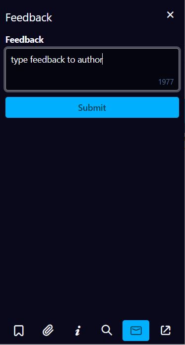
Feedback (VOD & Live)
The Feedback tab allows viewers to send an email to the presentation owner. This feature is enabled in the Presentation Type or Creator. Additional email addresses may be added when enabled in Creator. Following submission of feedback, the viewer will receive confirmation it was sent at the top of the window.
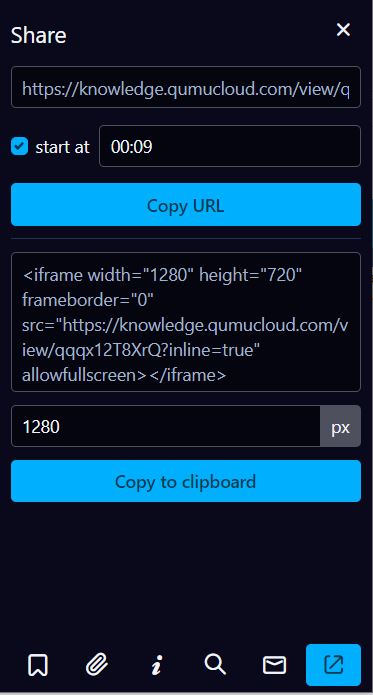
Share Tab (VOD & Live)
The Share tab provides two options of sharing the presentation: copy the link or copy the embed code. When copying a link, you may specify the time stamp of where they should start watching. The pixel size may be specified for the embed code. This tab is enabled in the Presentation Type or Creator.
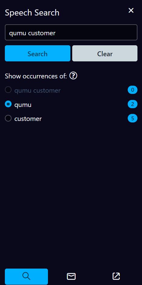
Speech Search Tab (VOD)
Viewers may use the phonetic search engine to locate words or phrases in a presentation. The results are displayed below the search window and as links on the timeline. Entering more than one word will produce results for the individual words and the phrase. This tab is enabled in the Presentation Type or Creator.
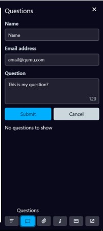
Moderated Q&A Tab (Live)
Use this tab to send questions to the moderator of the live event. Viewers that are not logged in will be required to enter their name and email address. Enter the question in the text box and click Submit. The viewer will receive confirmation that the question was sent. If the moderator chooses to make questions public, they will be displayed on this tab. Moderated Q&A may be enabled/disabled in the Presentation Type or Creator.
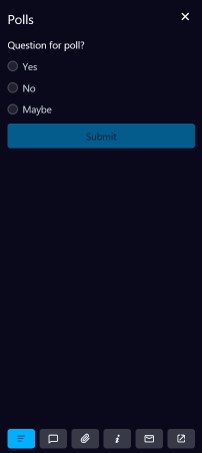
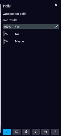
Live Polls Tab (Live)
The presenter may elect to poll the audience during a live event. When a question is opened for responses, it is displayed in the Polls tab. Viewers select their answer and click submit. The current results may be displayed on the screen. Poll questions are added to a presentation in the Creator.
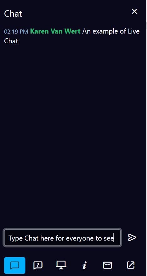
Live Chat (Live)
During a live broadcast, viewers may chat with each other in the Live Chat tab if it has been enabled. Moderators may also use this as a tool to communicate to all viewers. Type the message in the text box and click the send arrow. The Chats will be displayed in sequential order with the most current on top.
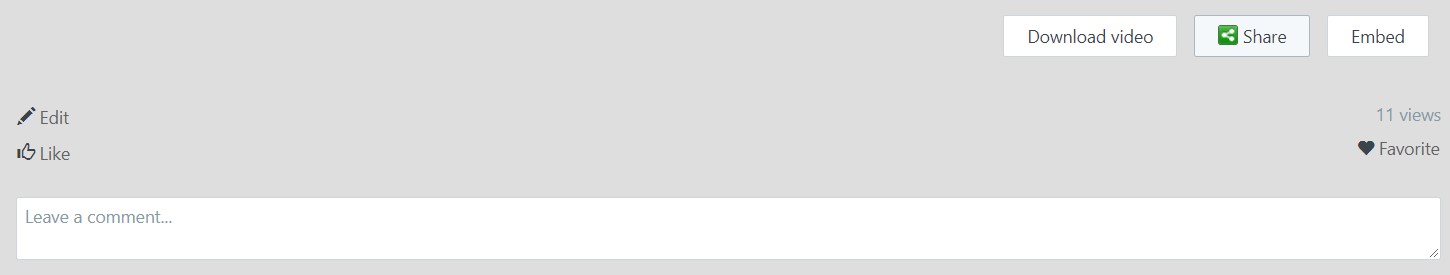
Widget
When accessing the player from a widget or viewer portal, threaded comments, like, favorites, download, share and embed functionality may be enabled from the Presentation Type or Creator. The number of views will also be displayed. If you have rights to edit the presentation, you will also have an Edit button available for easy access.
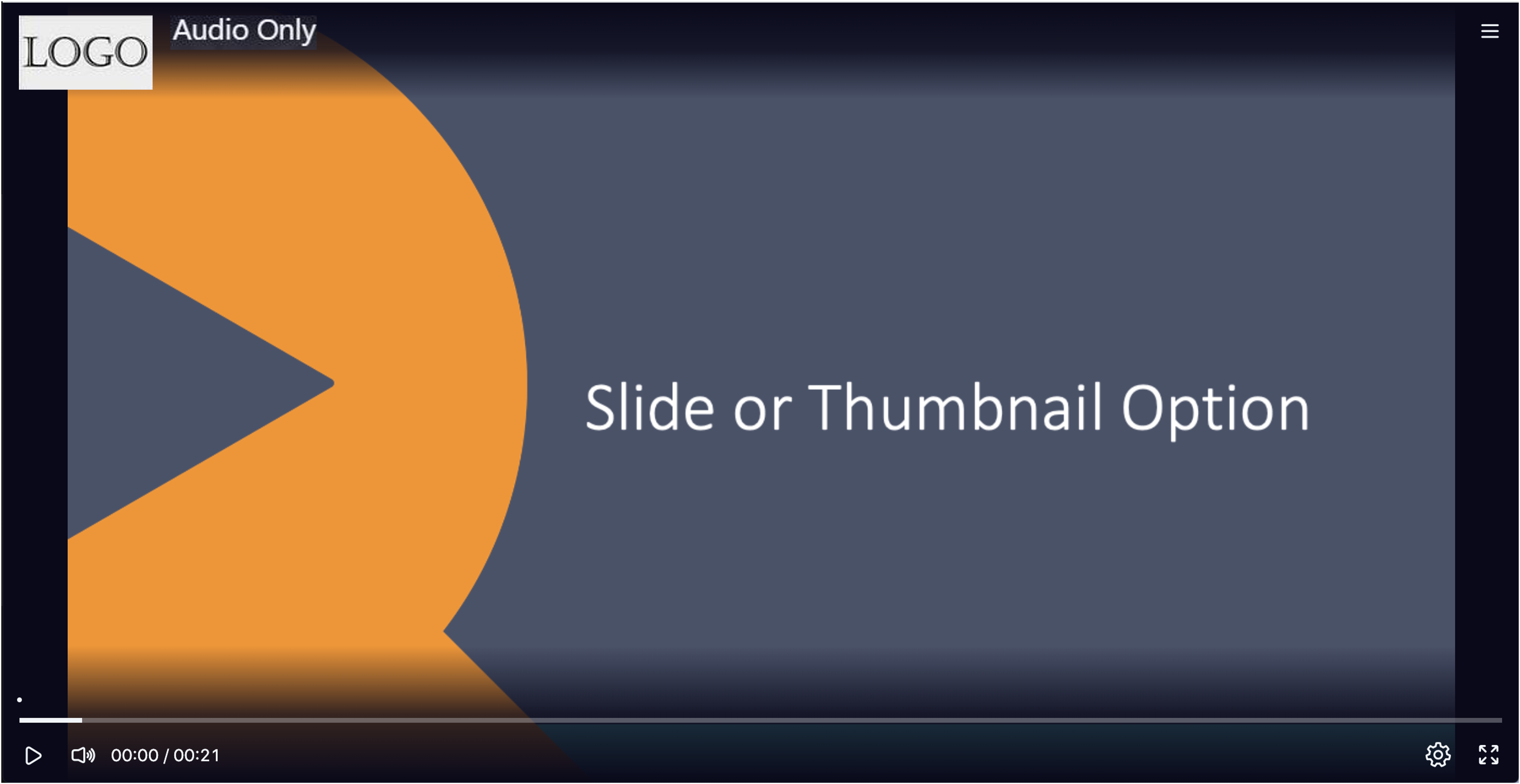
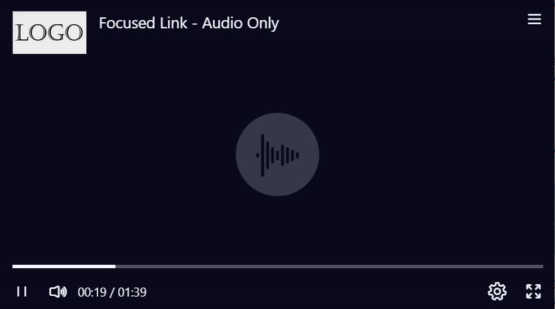
Audio Only Media
Presentations that contain audio only media will display one of three images in the player: slides, thumbnail or audio image. If slides are available, the slides will be displayed. When neither slides nor thumbnail are available, the audio icon is displayed.
All applicable controls and tabs may be enabled for an audio only presentation.
Presentation Type
Various aspects of the player may be controlled by the administrator in the Presentation Type definition. The administrator may enable, disable or leave to the creator’s discretion the player features: Feedback, Likes, Comments, Live Moderated Q&A, Live Chat and Browse live event slides. The Info, Share and Speech Search tabs may be enabled/disabled and which tab is open when the player loads can be selected. The media asset download may be enabled or disabled.
The player can be branded with a presentation type specific logo. The logo image should be 50 pixels in height, or it will be resized to fit. The width is variable. File formats supported included JPG, PNG, GIF and animated GIF.
Creator
In the Presentation Type, the administrator may choose “Creator’s discretion” for player features. This opens the field in Creator to be enabled or disabled at the presentation level. Feedback, Info Tab, Share, Speech Search, Live Chat, Live Q&A, Comments and Likes are on the Info & Settings page. Media asset download, Mobile offline viewing, and Guest Playback token are on the Distribution page of Creator.
Actions
The player behavior may also be defined by Actions set in Creator on the Media panel. A specific time, event or chapter is used to trigger an Action. Actions include:
|
Switch to Video Only |
The media fills the player as a single frame. This action is only effective when slides are associated with the presentation. In effect the slides are hidden when this action is applied. |
|
Switch to slides only |
The slide image fills the player real estate. This action is only effective when slides are associated with the presentation. In effect the media is hidden when this action is applied. |
|
Switch to default layout |
The default layout assigned on the Info & Settings panel is applied. |
|
Switch to alternative layout |
If more than one template is selected in Creator, the template not defined as the default layout will be applied. |
|
Move PIP box to a different position |
By default, the PIP box is displayed in the bottom-right corner of the player window. This action moves the PIP box to one of the four corners (top-left, top-right, bottom-left, bottom-right) This can be helpful if there is information on a slide that will be covered by the PIP box. This action is only effective when slides are associated with the presentation. |
|
Switch to large video |
Switches to PIP layout with the video in the primary position. This action is only effective when slides are associated with the presentation. |
|
Switch to large slides |
Switches to PIP layout with the slides in the primary position. This action is only effective when slides are associated with the presentation. |
|
Show a specific tab in the side panel |
The action has a secondary field to specify which tab will be shown. Chapters, info, feedback, share, speech search, custom. |
|
Play video |
Use this action to auto-play the video |
|
Pause video |
Pauses the video to allow time for the viewer to take action. When using this action, it is helpful to provide the viewer of what action they need to take and that they will need to start the video play back after completing their task. |
|
Pause video for…. |
The presentation will pause for the specified number of seconds and automatically continue playback. |
|
Load a specified webpage as slide |
This is designed to replace the slide with a webpage. Qumu recommends testing the URL prior to publishing as the webpage could be prevented from displaying in an iFrame, there could be a certificate restriction or a browser configuration preventing this from working in all cases. |
|
Replace player with a defined web page |
Redirect the viewer to a web page for more information, to take a quiz or complete a task. The presentation becomes part of a workflow. The viewer will receive a message that they are being redirected in 5 seconds. |
|
Skip to specific time in the presentation. |
Skips from one point in the presentation to another. Either forward or backward. Use this action to focus the viewer on the important parts of the presentation. |
Accessibility
The player complies with accessibility standards (e.g. ADA). All elements of the player are well labelled for screen reader capability, the design is high contrast to accommodate sight impaired individuals.

An example of accessibility capability is the information panel that appears indicating an action is being executed, changing something in the player.
An additional accessibility element is added when the player is embedded in a widget with size constraints, a button to open the player in a new frame is available.
Keyboard Shortcuts
Keyboard shortcuts are an alternative to using a mouse. A list of these shortcuts, as well as instructions for enabling and disabling, are available in the documentation found HERE.
Player Branding
By default, the Qumu player has a black background with bright blue accents, light grey buttons and no logo. This branding may be modified to conform to organizational branding.
Logo
A logo may be added to the retractable banner in the Presentation Type, allowing a different logo for each Presentation Type. Alternatively, a logo may be applied globally in the Player Config tool. Logos uploaded to the Presentation Type will override logos uploaded to Player Config.
Acceptable logo file formats include JPG, PNG, BMP, GIF and animated GIF. 50 pixels in height is ideal to comply with resizing requirements. There is no width restriction; the presentation title will appear to the right regardless of size of the logo. Clear Logo will remove the logo from the retractable header.
Color Scheme
All modifications of the color branding are done in the Player Config by an administrator. The Player Config preview pane allows you to preview any modifications while editing. Changes will not be reflected in the player until they are saved, making modifications effective globally.
The color scheme may be modified by selecting a pre-defined theme or changing individual color elements. To apply a color theme, click on “Load a predefined theme” and select a theme. The modified color scheme will be reflected in the preview player.
The color scheme may also be changed by modifying each individual element. Select the element to change and either use the color picker or enter the hexadecimal, RGB or HSL value for the color desired. Use the arrows to the right of the input fields to change the input format between HEX, RGB and HSL. The impact of the color change is immediately reflected in the preview.
The Reset to Default next to each element will reset the color to the system default color. The Reset button at the bottom of the page will reset all the color elements to the last saved scheme.
Clicking Save will save all the color elements and apply the scheme globally.
Player Parameters
When embedding or calling a presentation you may also define behavior using Player Parameters. Player parameter behaviors include controlling the auto playing of a presentation, if the presentation will play continuously in a loop, if the presentation will start at a specified time rather than the beginning, controlling the size of the player or the volume, enable captions and which language to play, if reporting data will be captured or a reporting id will be used and if the sidebar is disabled.
A list of valid Player Parameters is available in the documentation.
Registration
Registration allows the organization to capture information from the viewer prior to the presentation playing. When registration is enabled for a presentation, the viewer will be prompted for their email address when the player loads. The email is checked to determine if it is already registered to view the presentation. If any additional registration fields are required, the viewer will be prompted for those fields. Once registration is complete, the player will automatically load the presentation.
Email is the only mandatory field to complete the registration process. Additional metadata fields may be created by an administrator. Registration is enabled in the Presentation Type and metadata fields are added.
Registration reports are available in the reporting and analytics tool.
Disclaimer
A disclaimer is a legal statement that defines rights, liabilities, and risks that may be assumed when a user accesses video content. This may include but is not limited to copyright or intellectual property information, warnings, confidentiality notices, terms and conditions, trademark or patent statement.
There are several ways to apply a disclaimer to a presentation:
- Create a short video of a written disclaimer and use it as a pre-roll or post roll. A roll is appended to the media and plays in the player before or after the main media.
- Add a custom metadata type that is displayed in the Info Tab of the player. This is useful if the disclaimer is to be beside the media or the disclaimer needs to be tailored to a specific presentation.
- Create disclaimers in the Disclaimer Library that can be applied via the Presentation Type or Creator. The disclaimer library may include disclaimers that require the viewer to acknowledge the disclaimer before viewing the presentation or disclaimers that are displayed for a specific time period prior to playing the video.